Maya Kids
Project Type: Individual (Self-initiated)
Activities: Understanding Brand, Logo Ideation, Logo Design, Logo & Brand Cohesiveness
Tools: Adobe Illustrator, Hand Drawing
Process Map:
Brand
Background:
Taking an interest in logo design and brand identity, fuelled me to take up this self-initiated project.
The hypothetical company that I chose to create logos for was Maya Kids, a clothing company for kids that made sustainable, hand-stitched clothing.
The task at hand was to create different versions of a logo that represented and communicated what the brand does while also serving as a tool to instill brand recall.
After creating multiple versions of the logo, we had to select one that we felt was most appropriate to fulfill the needs of the task and recreate it on Adobe Illustrator.
The brand would then select the logo that they felt suited their needs the best.
Problem Statement:
What kind of logo can bring about brand recall and communicate the concept of sustainable, hand-stitched clothing for children?
Brand Identity:
The brand focuses on sustainable clothing, thereby standing in good stead with the customers
The clothes are hand stitched, showing a level of craftsmanship and support towards manual work
The brand is solely focused on making clothes for kids which means the logo must appeal not only to the kids, but must catch the eye and remain in the minds of the customers; parents of children
Logo Iterations
Final Logo Evolution and Iterations:
Initial Logo Iterations:
The initial logo iterations that I completed were done in the process of ideation, trying to come up with as many concepts, colorways and elements as I could to communicate brand identity. At the same time, I was looking to create a logo that could easily be used across different media. As a result, I did not go ahead with any of the initial logo iterations that I created. Instead, I decided to use one as a base and added elements to it to make it a cohesive representation of the brand, its offerings and the vision based on the understanding I had as a designer and brand strategist.
Learnings:
Using and understanding a client brief in design and strategic thinking
Process of creating logos starting from the understanding of the client brief, iteration of logo creation and final selection
Using Adobe Illustrator for logo design and iteration
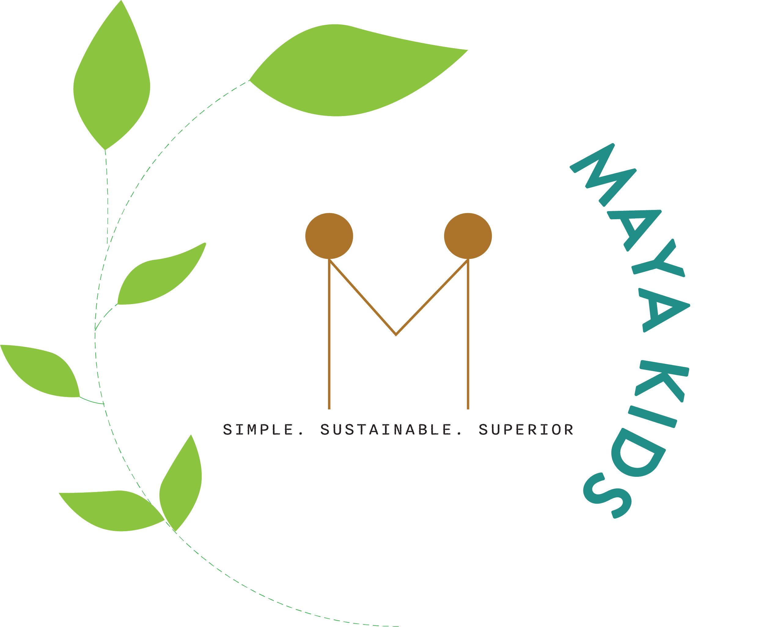
This logo captures the identity and offerings of the brand.
The logo in itself is simple, with a few elements to convey the principles on which the brand functions.
The leaf element signifies sustainability. A plant growing, only to keep becoming larger is one way of representing the futuristic output of sustainability (continued existence of natural resources due to intergenerational equity considerations taken in the past).
The two stick figures in the center represent two kids who come together to form the letter “M.” Kids signify innocence, potential for growth and variety.
The stem of the leaf has been created using a dashed line to signify the aspect of clothes being hand stitched.
Lastly, I decided to stick to bright colors and focus on greens and blues as they are very natural and positive colors. They instill a sense of calm and energy at the same time which I felt would be good to keep the brand image in the minds of customers.


